
MarketWatch Navigation Redesign
Redesign of MarketWatch’s navigation system to improve usability, content discoverability, and user engagement through data-driven information architecture, inclusive design practices, and iterative testing across seven rounds.
Role: UX Lead, UX Architect
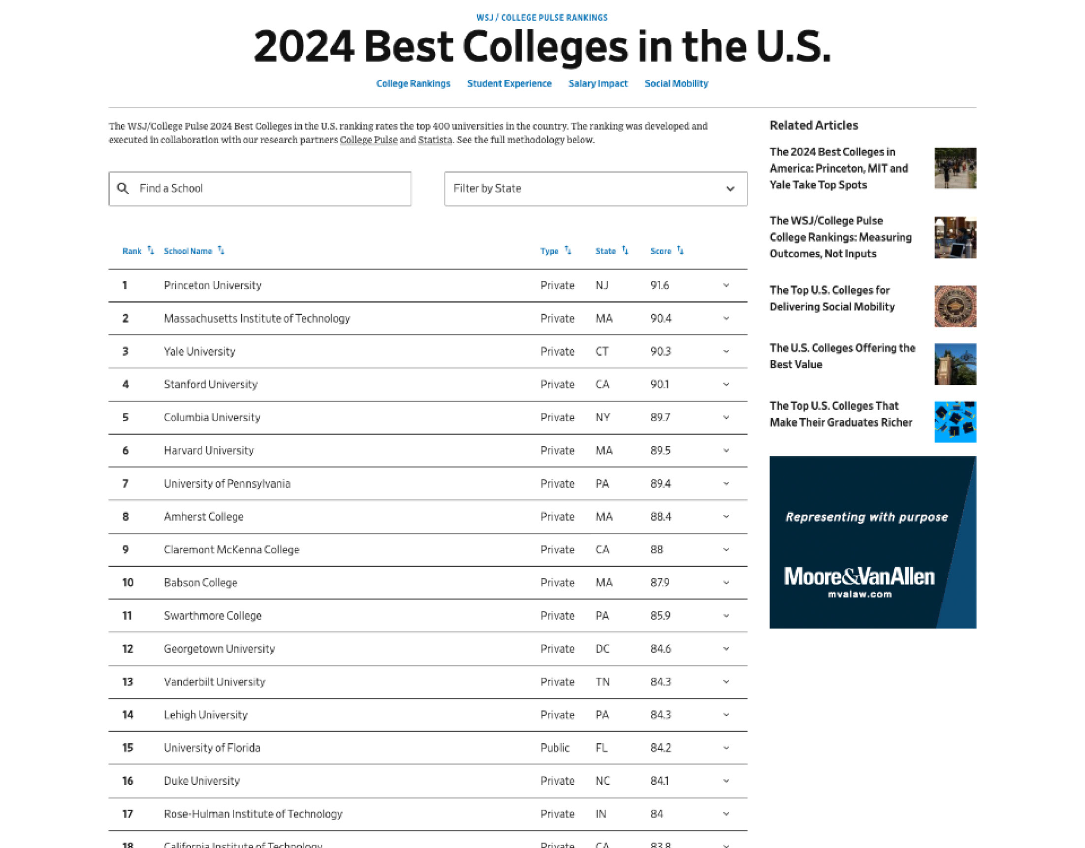
WSJ College Rankings
Redesign of the Wall Street Journal’s College Rankings experience and development of a reusable data table component for the Dow Jones Unified Design System.
This user-focused solution improved readability and performance, helping the experience surpass its annual subscription goal within 10 days of launch.
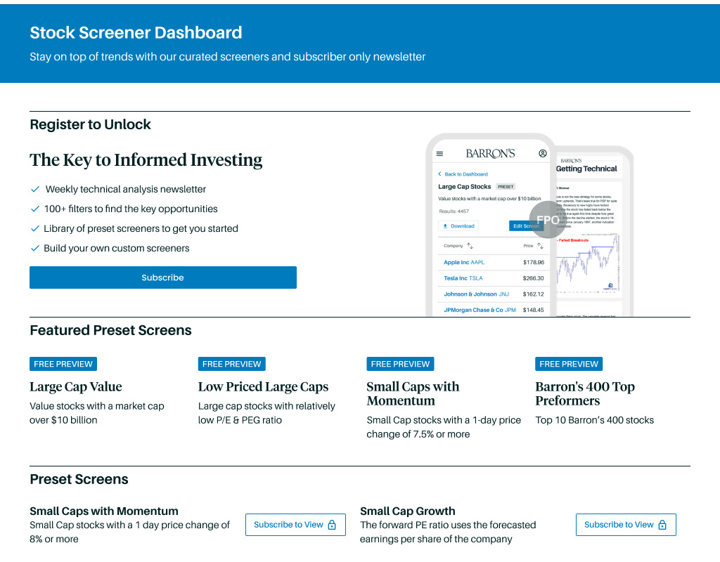
Barron's Stock Screener
Design of a new stock screener tool for Barron’s subscribers, helping traders and investors filter and evaluate stocks using canned and custom search criteria.

Wall Street Journal Persona Development
Creation of WSJ Personas utilizing UX Methodologies to drive NextGen website redesign
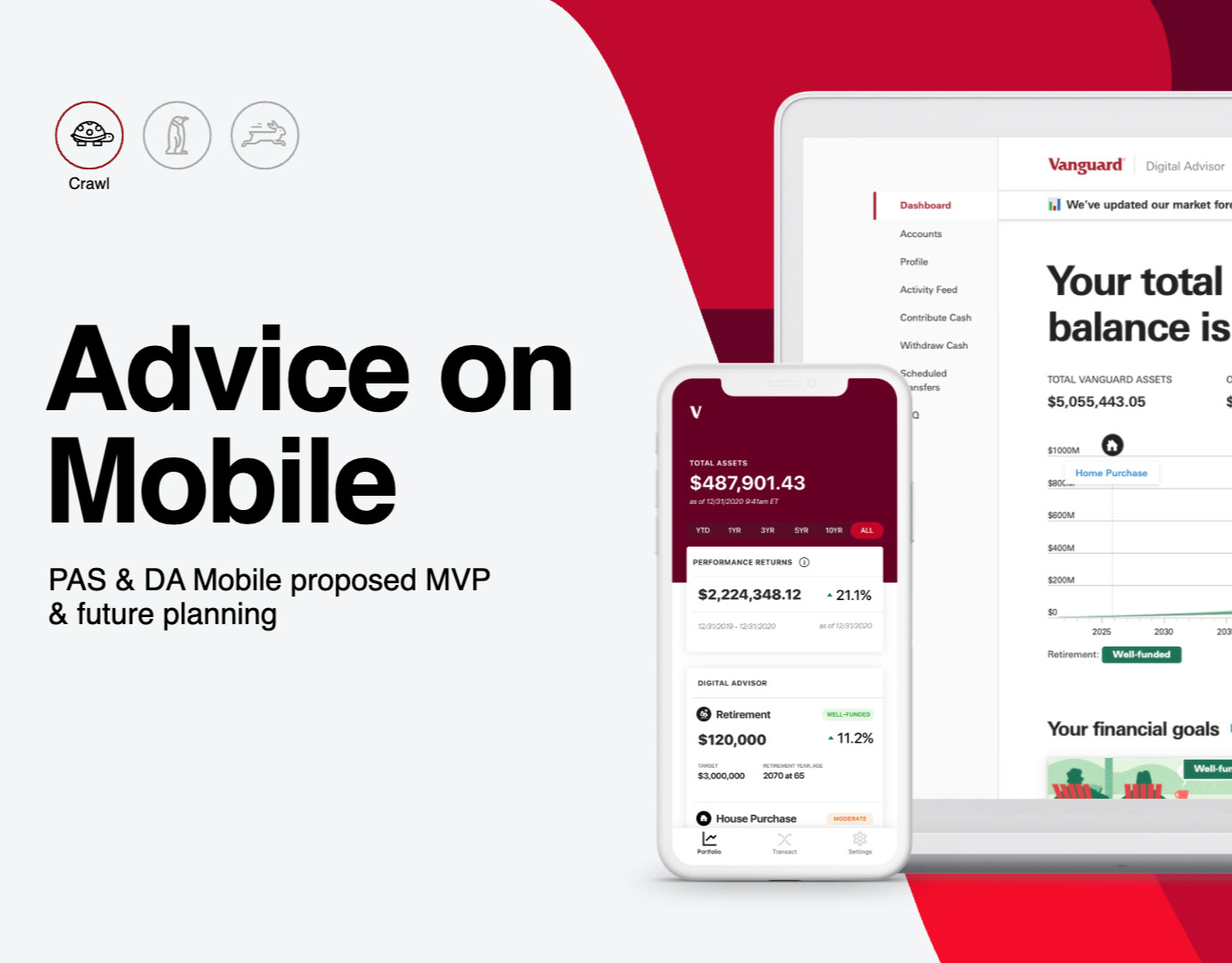
Vanguard PAS/DA Mobile App Strategy Reset
Defined a unified mobile experience strategy for Vanguard’s managed services by aligning siloed teams around key client needs, shared KPIs, and a value-based delivery approach.
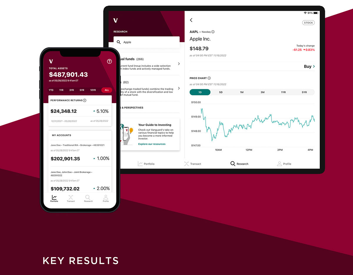
Vanguard Mobile App Redesign
Redesign of Vanguard’s mobile app to deliver a modern, intuitive investing experience tailored to the needs of emerging generations while still supporting legacy clients.

Standardizing UX Processes & Agile Team Incorporation
Establishing UX/JIRA workflows, processes, systems of record, standardization of project requirements, deliverables, and UX best practices across Vanugard CXD departments, Families, & Labs.

Vanguard Tax Center MVP
Initiative to create an intuitive tax experience that empowers clients to confidently file their taxes and maximize their investment success.

MSC UX Strategy & Roadmap
Current state analysis to identify opportunities, target audiences, process gaps, establish/evangelize UX methodologies within MSC, and development of the FY19-20 UX roadmap.
To ensure understanding and alignment across stakeholders, I approached this project utilizing a wide range of methodologies.
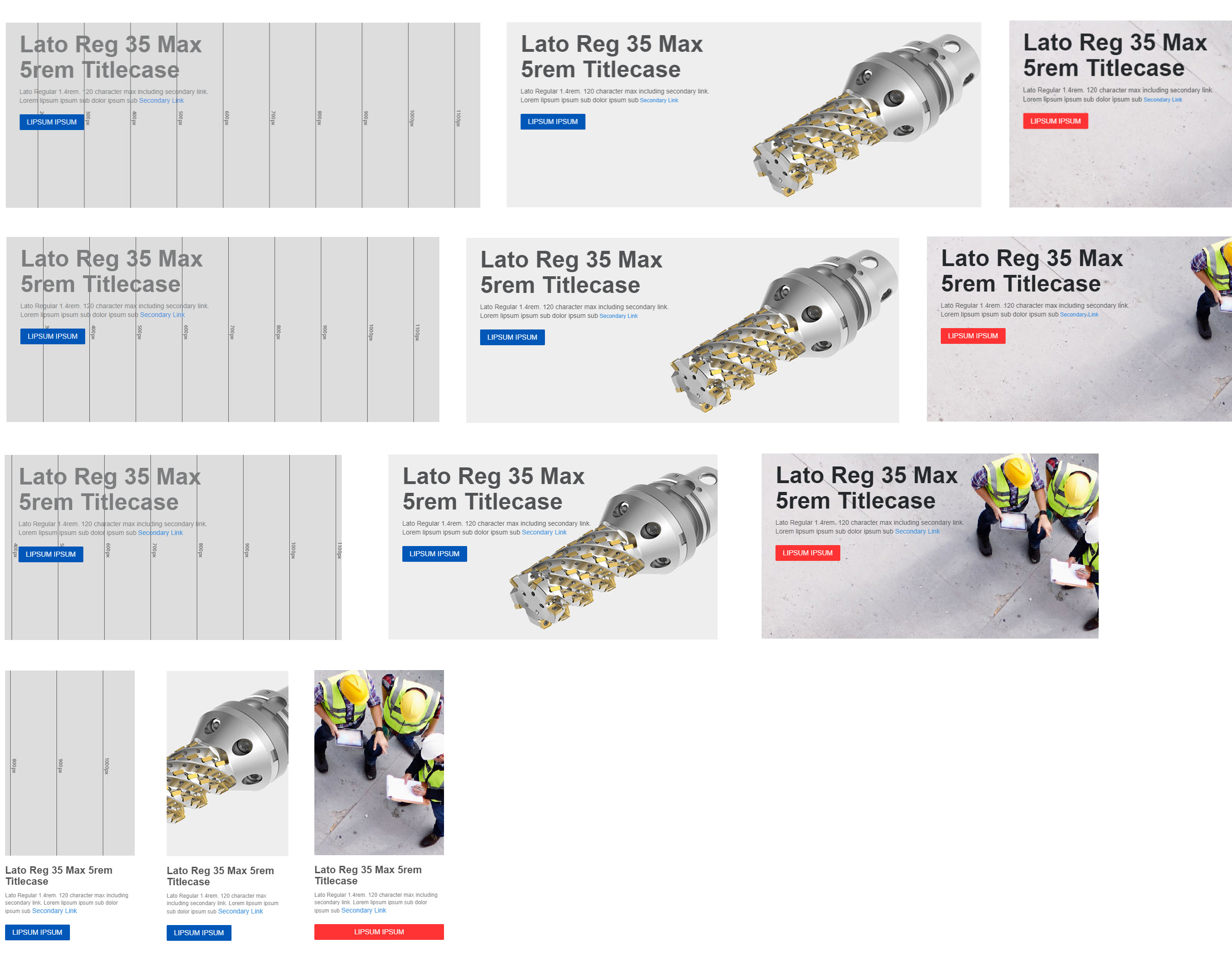
MSC HTML Banner Templates
Standardizing banners across mscdirect.com into reusable components increasing engagement/click-through, and supporting a consistent, responsive, and accessible user experience.
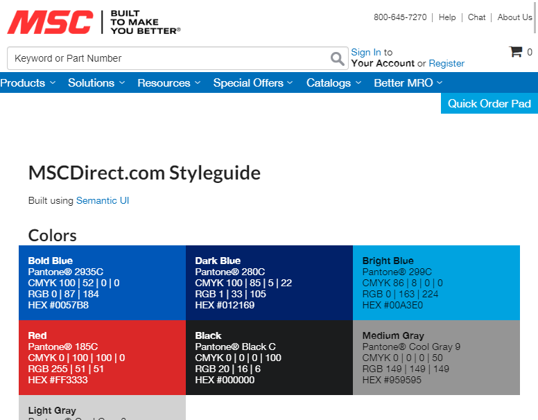
MSC Design System
Creating a consistent, standardized, responsive, and accessible user experience across MSCDirect.com utilizing & expanding upon semantic-ui with IT partnerships

Financial Center Kiosk Prototype
Project to help a top 5 bank answer: How can we reduce perceived wait time for Platform services and positively impact the Overall Satisfaction Scores to optimize the financial center experience?

UX Conference Talk
You are Not the User - Learning the Hard Way
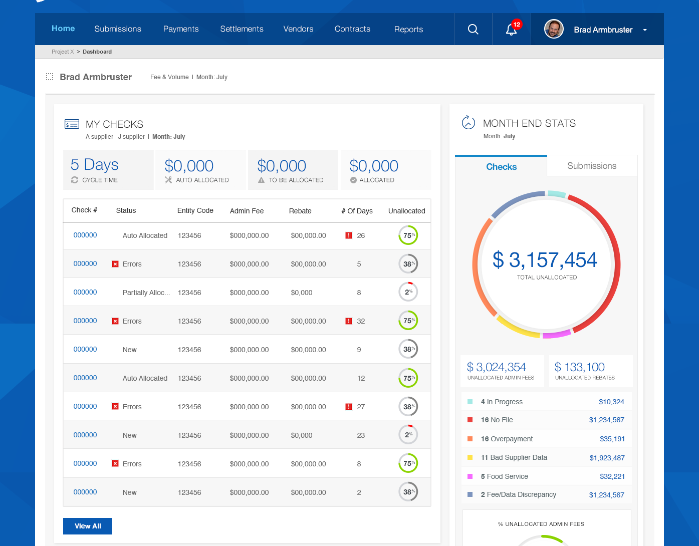
Premier - Internal Platform Redesign
Large scale internal financial application redesign to decrease end-of-month operating costs, and reduce data-entry/manual process errors and new associate training costs
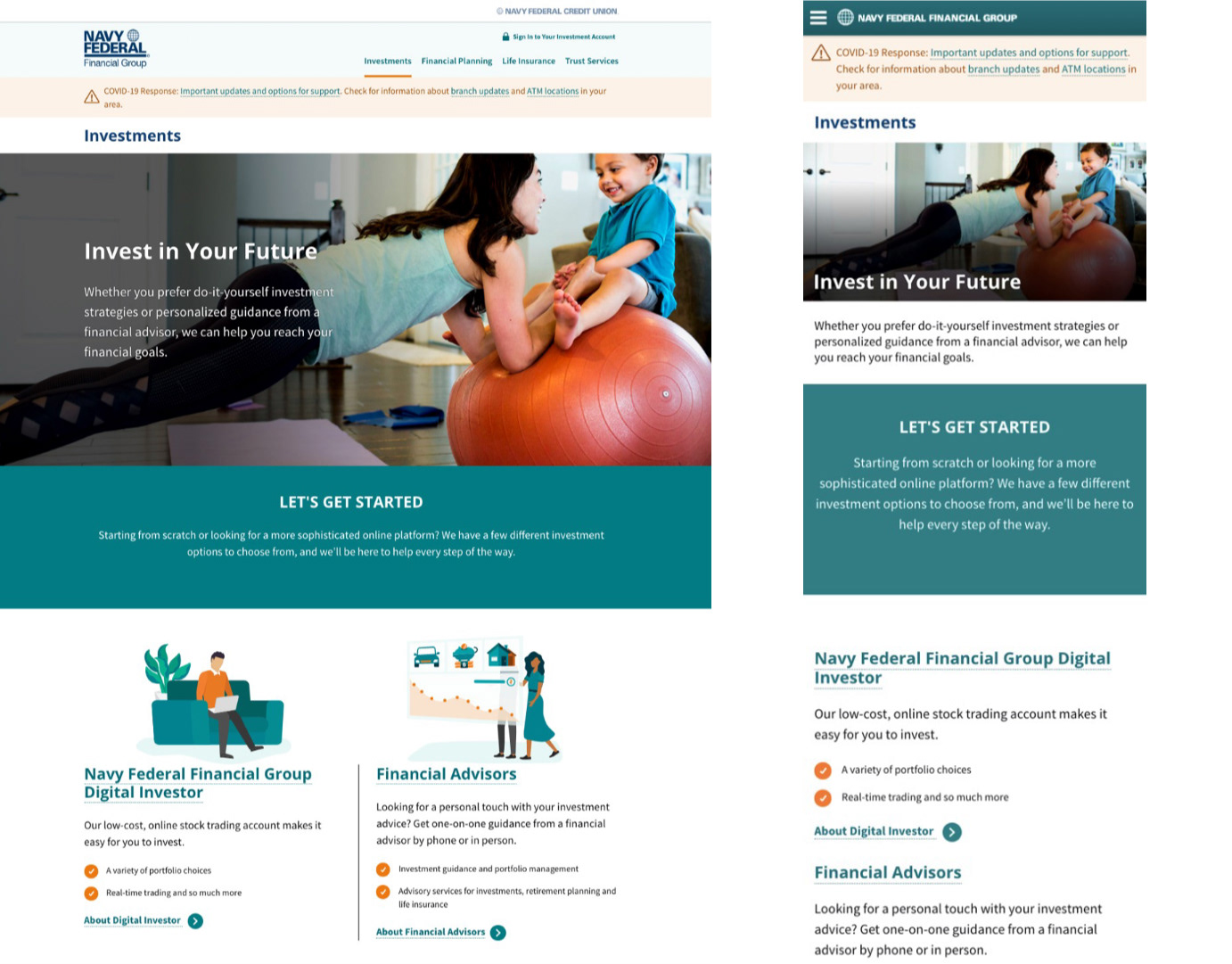
NFFG Journey Maps, Personas, & Website Redesign
Financial Services website redesign utilizing UX methodologies to identify customer pain points, areas for improvement, and to craft a user-centered strategy supporting business goals and objectives.

Founders Hall Interactive Learning Area
The Interactive Learning Area is a proof of concept for the Founders Hall Virtual Center located within the Bank of America Corporate Center. It consists of six touchscreen devices, housing refactored Better Money Habits® and Merrill Edge® content to create engaging and actionable experiences for current and potential customers.
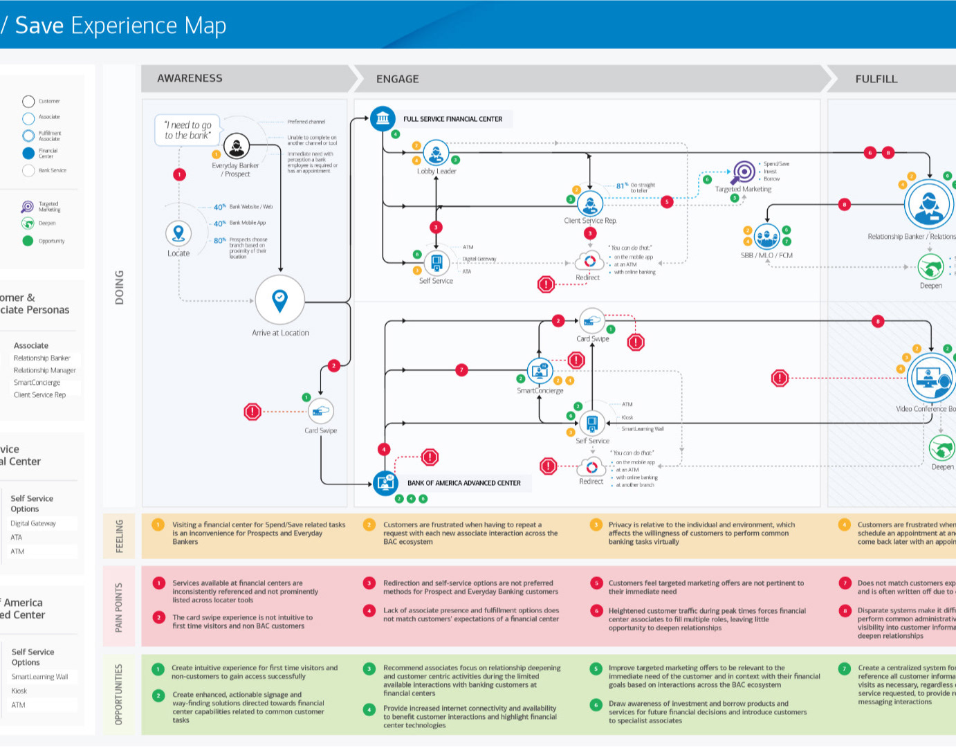
Top 5 Bank Personas & Journey Maps
Positioning Top Bank to Identify Future Marketing Opportunities & Expand Customer Accounts